Shen Sixuan

Welcome to my page, here's a little about me.

My English name is Vera and I was born in 2000. Currently studying Digital Media at Leeds, with an undergraduate degree in Communications and Psychology. Loves travelling, reading and connecting with people in depth.My dream is to be able to design warm digital products that enhance user experience in the future.
[Click the link below to visit the finished game]:
Go to About Page

Course Reflection

Below are my course reflections for each session. It contains thoughts on the lectures as well as a record of the practical experience of the workshop.

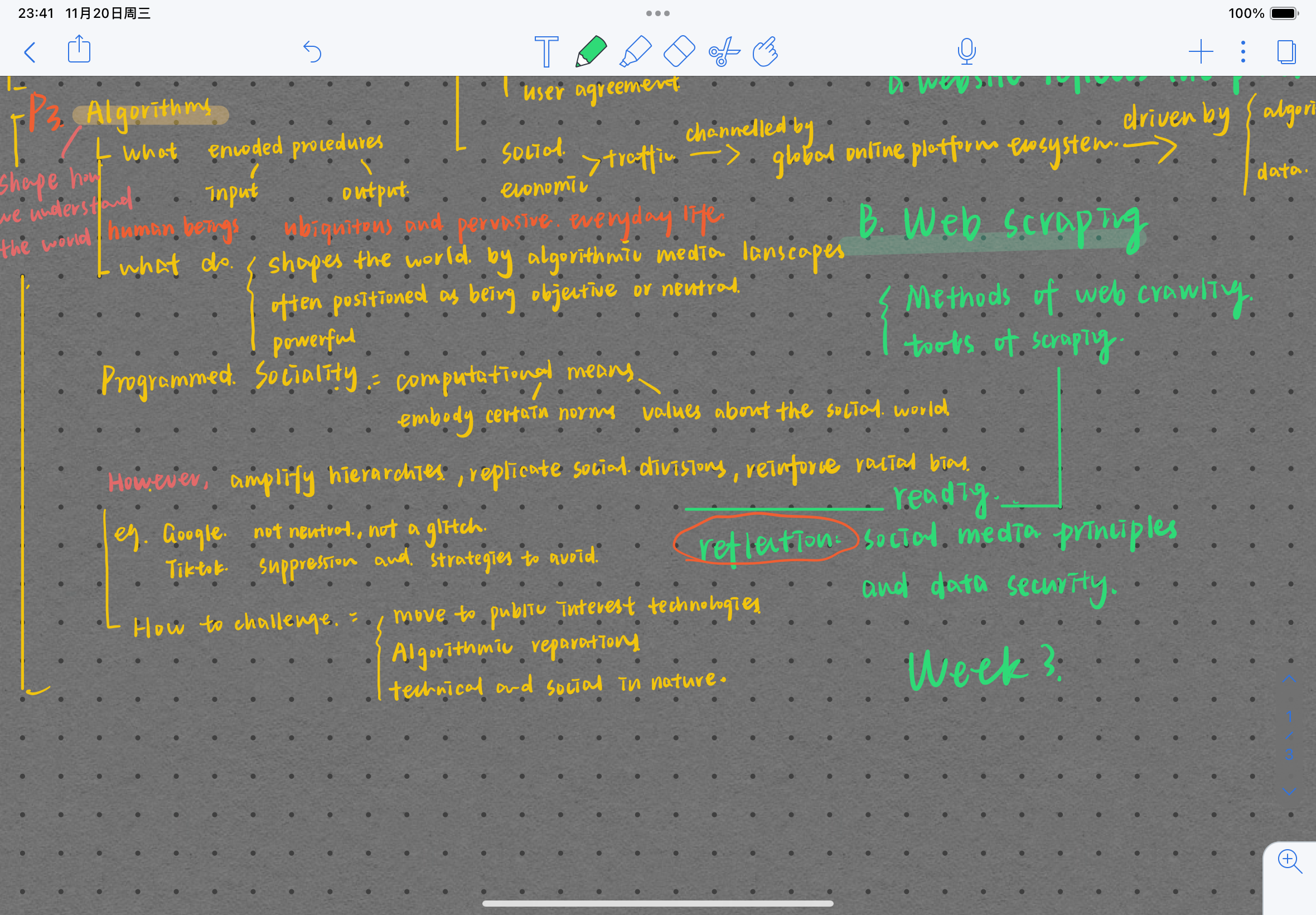
week2 How the platform constructs and holds power

The Mind Map

Content Review
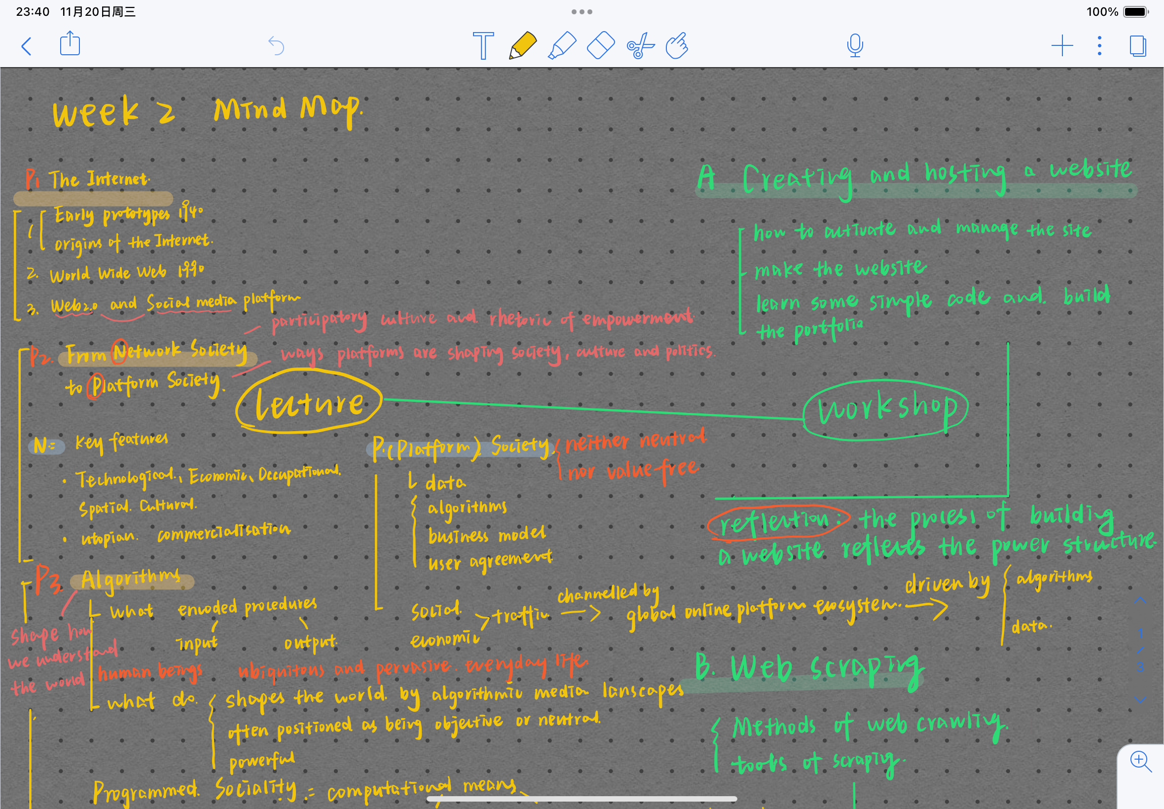
Thelecture of the second class contains three parts: the development of the Internet, from network society to platform society, Algorithms.In the workshop of the second week we learnt how to build a web page, in this class the teacher introduced us to HTML and CSS, and how to upload In this lesson, the teacher introduced us to HTML and CSS, and how to upload a web page to the server. In this lesson, I tried out some basic code and understood the basic process of building a website.

My Reflections
One of the things that gave me more food for thought was the understanding of platforms. When I tried to build my own website in workshop, I noticed that it was a 0 to 1 process, which means that excluding the content of the website itself, the structure of the website, the colours, the way it interacts and the way the modules are arranged are all determined by the builder of the webpage. For example, when I decide to place the profile more prominently, it directs the viewer's attention to this section first, while other sections may be ignored, so I essentially have control over the user's attention and behaviour.
More notably, when I myself use social media or other online platforms in my daily life, I only focus on the content and the interaction with others, and rarely notice the power that the platforms have. This power structure manifests itself in many ways: the information architecture of the page, the visuals, the control of the algorithms, the collection of user data, and the guidance of emotions and behaviours. For example, when we open tiktok, the smooth video content instantly captures our attention, and when we comment, like and retweet, our clicks become data that the platform can access and analyse, and the platform readjusts its algorithms based on the analysis of the big data in order to further increase user interest and improve user stickiness.

Connecting with READING and exploring further
As (Hoffmann, 2018) argues, the explosive growth of expressive platforms requires us to rethink what a platform is and to think more about the power of platforms in society. When we talk about the platform society, we realise the inextricable relationship between online platforms and social structures (Dijck et al., 2018).
By reading Dijck et al.'s ’The platform society : public values in a connective world I realised that social media platforms are often seen as ‘tools’, but in fact they are not tools, they exist as a collection of power. In an algorithmic process, it makes some things visible while hiding others. Moreover, platforms also collect a lot of user data and content data, and they profit by automatically connecting users, data and adverts. What's more, the data collected by platforms isn't exactly ‘raw’ when they design user interfaces and choose user features that largely guide the way users interact with each other. This results in pre-established data collection mechanisms that platforms can shape and trigger to collect pre-determined, structured data, which in turn influences the structure of the platform, which can choose to highlight certain parts of the content with an emotional slant, prompting the user to take action.

Dijck, J.v., Poell, T. and Waal, M.d. 2018. The platform society : public values in a connective world. New York, NY: Oxford University Press.
Hoffmann, A.L. 2018. Platforms of power Custodians of the Internet Tarleton Gillespie Yale University Press, 2018. 296 pp. Science (American Association for the Advancement of Science). 360(6394), pp.1193-1194.

week3 Data Scraping,Platforms and User Privacy

The Mind Map

Content Review
In this lesson, we learnt the basic methods and tools for web data crawling. In the lesson, we used crawling bbc video web content as an example to think about what are the valid information we can crawl in a web page, and at the same time, I learnt about the limitations and rules when it comes to web crawling. At the end of the lesson, we were tasked to create a topic that we wanted to investigate and realise our purpose through data collection and crawling.

My Reflection.
We wanted to understand the correlation between the school's employment rate and the online employment services offered by the school, and thus investigate the importance of students' digital engagement. Therefore in addition to regular data collection, we decided to look for information on digital engagement on social networks, we tried to collect the frequency and amount of interactions with the content of the career services posted by different colleges and universities on social media platforms. Using ins gram as an example, we collected the number of employment related content, the number of likes and comments from 50 HEIs, from which we could determine the online employment services provided by the schools and the digital engagement of students.
One of the findings is that the level of students‘ digital engagement in social media can reflect to some extent students’ approval of the content. Social media fulfils the promise of communication as exchange; it is a space of mutual language and response.1 As social media platforms go, they are built and set up to encourage communication. In turn, this immediate communication that allows for positive feedback can influence the creators of the platform's content, which in turn can further satisfy users' needs or even influence their behaviour and shape their decisions.
When we attempted to crawl ins gram using a crawler tool, we were hampered by the fact that the ins website has a well-developed anti-crawler setup. This anti-crawling mechanism also reflects the platform's policies and principles, which are both a means for the platform to protect user data and privacy, and a necessary measure to safeguard the platform's interests and operational efficiency. In 2, it is written that people may think that these guidelines are only superficial - the principles sound so clear and reasonable but in reality have little to do with the actual implementation of the policies, and while these community guidance documents may be strategic and self-serving gimmicks to some extent, they are expressions of principles. Many users have strong concerns about the platform's privacy invasion, and indeed its sheer size and chaos does pose strong privacy concerns, but the creation of the anti-crawler mechanism can also be seen as one of those expressions of principle, reflecting the platform's mission and guidelines.

week4 Data is not an oil

The Mind Map

Content Review
In Thursday's workshop we learnt how to create a dataset and discussed in small groups what we were collecting data for, the variables we wanted to collect, the methods of collection etc. and thought about the ethical issues it raises, the implications etc. At the end of the lesson, we worked together to collect data on employment rates and the relevance of digital participation and collated a full dataset by looking at employment websites, college profiles and grabbing data from social media.

My Reflections.
As our group collected data, I better understood why ‘data is oil’ is a biased statement; when we refer to raw data, we often default to unprocessed datasets as raw, which is not the case. We went through such a long process of decision-making, selection, filtering and collation before generating a final dataset on college employment rates and digital engagement. For example, when choosing the social media outlets that reflect the careers service, we chose ins gram, which has relatively more interactions, and screened out Facebook; we decided to select a selection of HEIs in the UK region, chose to measure the level of the school by the number of first class honors degrees, removed variables that were not good to collect, and so on... So, I understand better that even seemingly unanalyzed data is full of manual filtering and choices, a step that occurs throughout almost the entire data collection. I must admit that our screening methods are not rigorous enough, and this reminds me that data is presented with bias and subjectivity, and that we should be wary of seemingly objective and unbiased data in our lives.
In the lecture, the webpage article Humans Are Biased, Generative AI Is Even Worse also provoked my thoughts, the author argues that stable diffusion's text-to-image model amplifies stereotypes about race and gender. The authors analyzed the perpetuation and deepening of prejudice against stereotypes by experimenting with stable diffusion, an AI software that generates images, which in turn has an impact on users. ‘For every part of the process in which humans may be biased, AI may also be biased, and the difference is that technology legitimizes bias by making it seem more objective.’ This article made me rethink my use of and trust in AI, when we recognize the answers that AI gives, do we always overlook the biases and limitations that come with structured questions.

Connect with reading and explore further
The article Dialogues in Data Power states that data has a history as well as a purpose, and that measurements are made by certain people for certain reasons; answers to specific questions are derived from specific respondents. The purpose for which data is collected may be malicious, beneficial, or banal; the sample population may be representative or biased; and the data collector may be identified and informed by the nature of the location in which he or she works or may simply perform it through a letter note (Jarke et al., 2024). While we may be able to be cognizant when we are simply confronted with the presentation of visual data, questioning the source of the data, questioning the manner in which it was collected, etc., how should we respond when the data becomes presented in the form of AI?
It is worth thinking about how this manipulation and bias seems to become a more invisible presence when the data becomes something below the surface and the only interaction with a human being is the answers that the AI provides you with. It is written in AI Empire that this is exactly what AI achieves: the use of large amounts of data, which is often used to identify patterns or trends and to influence decision-making (Crawford, 2021).Ai exemplifies its creator bias, with the creators being a relatively homogenous group of predominantly young, white, male, heterosexual, able-bodied, free-wiliest and affluent engineers and entrepreneurs (Tacheva and Ramasubramanian, 2023). In this system, therefore, ‘heterosexuality and patriarchy are seen as normal and natural’ while ‘other configurations are seen as abnormal, aberrant, and abhorrent’ (Arvin et al., 2013).
On the other hand, the process of data collection, the exploitation of data labor, the constant monitoring of data subjects, etc., reflects the characteristics of data colonialism, and these mechanisms are datamined and fed into categorical, predictive and generative AI models for further use in behavioral control and engineering.

Jarke, J., Bates, J., Bates, J. and Jarke, J. 2024. Dialogues in Data Power: Shifting Response-abilities in a Datafied World. Bristol, UK: Bristol University Press, pp.1-9.
Tacheva, J. and Ramasubramanian, S. 2023. AI Empire: Unraveling the interlocking systems of oppression in generative AI's global order. Big data and society. 10(2).

week5 Visualisation as an artistic creation

The Mind Map

Content Review.
In week 5 workshop we learnt about data visualisation. Before the class, our group organised the collected data to get a dataset with multiple variables. During the data visualisation process, holly showed us how to create descriptive icons through excel, which is a simple visualisation process by which we can transform data into a form that can be understood or even a pattern that can be observed.

My Reflections
One small detail in the workshop was that we decided that the colour of the pie chart that came with it was not aesthetically pleasing enough and replaced it with a gradient blue colour, but holly suggested to us that this gradient blue colour was probably not conducive to distinguishing between different values and variables. At this point I realised that data visualisation should strive for a balance between comprehensibility and aesthetics, we need to present users with a clear, beautiful look at the data through the visualisation, but also need to make the visualisation comprehensible.
This is not the end of the road when producing a visualisation. We will find many discoveries through the visualisation that the data did not present to us visually, small patterns, and more importantly, more questions that we can ask as a result. If data visualisation is a personal skill or art, it is the ability to think graphically, as a form of question asking (McCosker and Wilken, 2014).

Connect with reading and explore further
As with the AI, data and platforms mentioned in previous courses, data visualisation carries the same risk of subjectivity. Some critics have argued that the resulting visualisations often ‘masquerade as coherent and tidy’ (Ruppert, 2014). Visualisations and the data within them seem objective, even though they are not. Visualisations are like windows into the data, which are certainly as objective as possible, but are equally subject to tools, subjective biases and data filtering (Kennedy et al., 2017).
Regardless, data visualisation has shown to be very important, and it provides a very effective method. ‘It's possible to find things that you don't have a theory for, that you don't have a statistical model to identify, but through visualisation it will jump out at you and tell you, ‘That’s weird’’ (Stensrud cited in Bollier quoted in 2010, 11). Many would describe the process of data visualisation as a kind of artistic creation and finding the order that belongs to us in the midst of the enormity and redundancy, trying to take control of it, is perhaps a great source of human fulfilment. As Kant puts it, ‘confronted with this apparent infinity’ or scale, the subject feels weak and small, but then recovers a sense of superior self-worth because the mind is able to conceive of something larger and more powerful than the senses can grasp’ (Nye,1994; see also Crowther, 1989; McMahon, 2004; Lichuan,1998).

Kennedy, H., Allen, W., Blank, G., Lee, R.M., Fielding, N.G., Fielding, N.G., Lee, R.M. and Blank, G. 2017. Data Visualisation as an Emerging Tool for Online Research. United Kingdom: SAGE Publications, Limited, pp.307-326.
McCosker, A. and Wilken, R. 2014. Rethinking 'big data' as visual knowledge: the sublime and the diagrammatic in data visualisation. Visual studies (Abingdon, England). 29(2), pp.155-164.

week7 Capturing those moments of scepticism about machines

The Mind Map

Content Review.
In week 7 workshop we learnt about machine learning, instructing a computer to build a model by inputting data, we practiced a simple version of Teachable Machine in class, where we trained a model by inputting pictures, videos, audio and poses, and subsequently used the model to predict certain content.

My Reflections
When inputting images, I tried to discover if Teachable Machine had any flaws. Firstly I found that it is better at recognising features, I had two very similar dolls but the machine could recognise the difference between my two dolls. But then I tried to build a library of different genders and train the model to recognise different genders, and when I asked the machine to recognise binary genders with more distinctive features, the machine almost always recognised them correctly, whereas when I tried to ask the machine to recognise a transgender woman, the machine was clearly in a quandary, believing that 42% of the portrait matched a male while 58% matched a female. One of the many reasons for this ambiguity is that I trained the model with only a binary gender pool, which reflects the logic of gender classification systems in many commercial applications and the neglect of marginal genders.


Connect with reading and explore further
Under the influence of binary gender theory, we are used to quickly labelling strangers across the street as male or female based on our perception of their visual presentation. This practice continues with facial analysis systems, which, like other biometrics, attempt to match an individual's identity to a record in a database based on his or her facial image. Facial classification, on the other hand, attempts to categorise individuals based on socially meaningful categorisation patterns such as age, gender and ethnicity. (Scheuerman et al., 2021) The consequence of such socially meaningful categorisation is that it is likely to exacerbate discrimination against marginalised racial and gender groups, exemplifying a racialised ideology that relies on the depoliticised tools of automated (and therefore allegedly objective) digital technology to validate the female/male binary.
I share this concern when trying to use facework, and while facial recognition technology is widely used in social media, smartphones, and security systems, this site reminds us of some of the abuses and data biases that artificial intelligence can have in the possible. While enjoying the convenience of emerging technologies, it's important to remain sceptical and critical: algorithms can fail, technologies can be flawed, models can be biased. These moments of insufficient trust allow us to make better progress.

Scheuerman, M.K., Pape, M. and Hanna, A. 2021. Auto-essentialization: Gender in automated facial analysis as extended colonial project. Big Data and Society. 8(2).

week8 Classification is a power

The Mind Map

Content Review.
The theme of the week 8 workshop was Identity, Algorithmic Identity, and Representation, and the class was divided into three parts: input, output, and process. First we browsed our social platforms, looked at the operating protocols of different social platforms, and observed and thought about what data was being collected by the platforms; then we browsed our own outputs from the social networks, looked at the backend of the adverts, and observed how the platforms described us, and why those descriptions were there; and finally, we went through the method of Sumpter to try to understand the algorithms that are used by social media to process the data .

My Reflections
What struck me was that when we opened the advertisement profiles on the google platform, we were surprised to find that the platform recorded a lot of categories related to the account, which we may not have been aware of ourselves, or which we did not recognise. Subsequently, I gradually understood the rationale of such categorisation during my experiments in simulating the way social media platforms operate. While it is true to say that many of the categories are accurate, reflecting our hobbies, life states, relationships, and even being able to find out the connection between the contents; on the other hand, such categorisation is also too rigid, as the complex life states and persona are inevitably simplified in the categorisation process. The context, meaning and motivation of the content become less important, which is not fair to the user.


Connect with reading and explore further
This feeling was similarly confirmed when I read Sumper's bibliography, where he argues that simplifying something to two dimensions is something worth considering, that principal component analysis and similar mathematical methods are fundamental to most of the algorithms we work with, and that while the actual amount of data is much larger, the basic approach is to reduce things until the algorithms begin to make sense of them. This simplification doesn't seem to cope well because when we use social media, our personalities have been put into hundreds of dimensions, our emotions enumerated and our future behaviour modelled and predicted. This is all done efficiently and automatically, in a way that is difficult for most of us to understand (Sumpter, 2018). Whilst this categorisation is simple and easy to understand, we should come back to reality and realise the power and limitations of this categorisation, and recognise ourselves and others in a more complex and multidimensional light.


Sumpter, D. 2018. Outnumbered from Facebook and Google to fake news and filter-bubbles - the algorithms that control our lives. London: Bloomsbury Sigma.

week9 Changing Communities

The Mind Map

Content Review.
The theme of the week 9 workshop was Digital Ethnography, in class we were asked to choose an online community, describe, analyse and discuss the community in order to develop an understanding of the community. This method is centred on conversation and perception to gain a more complete knowledge of something.

My Reflections
My partner and I chose very similar communities and we subsequently realised that we had different understandings and perceptions of the same issues, for example, she perceived the function of a community to be skill learning, whereas I perceived the main function of the community to be companionship. This cognitive bias made me realise that we focus on information and participate in community activities in different ways. On the other hand, it was interesting to see how the community itself evolved and changed over time and at different levels of maturity, and how our expectations as users of the community also changed.


Connect with reading and explore further
Digital Ethnography outlines ways of doing ethnography in the contemporary world, and it invites researchers to consider how we live and study in the digital, physical and sensory environment, and that we need to study it as it develops and changes. The five principles of digital ethnography are multiplicity, non-digital centrality, openness, reflexivity and unorthodoxy. I found that the experience of multiplicity is the same as the feelings we share in the classroom, and that there may be more than one way to engage with the digital.
Additionally, experience is a difficult category to study and analyse in human life because experiences are unique to the individual and we cannot access their experiences in any direct way. The process of doing digital ethnography can help us to understand the story of a life lived in a digital, physical, sensory environment and to understand the individual's relationship with their surroundings (Pink et al., 2016).


Pink, S., Horst, H.A., Postill, J., Hjorth, L., Lewis, T. and Tacchi, J. 2016. Digital ethnography : principles and practice. Los Angeles: SAGE.

week10 New Media and New Narratives

The Mind Map

Content Review.
In week 10's workshop we explored interactive narratives, looking at how digital media enables interactive narratives. Firstly we explored interactive games such as Space Frogs on Twine, thinking about and analysing how its story is built and narrated. We then tried to create the interactive story ourselves, planning the general structure of the story with a partner, then conceptualising its details and producing it, and we added lots of novel ideas along the way.

My Reflections
It was a very interesting process, making an interactive game is like building a building, building the structure of the building and then filling in the details of the building with characters, plot and imagery. On top of that, it's also about thinking like a user, thinking about how the guests discover the building, see the signposts, choose which room to enter, and what ending they get.
During the production process I realised that this kind of cybertext and interactive narrative is different from traditional narratives, and that this is a necessity for interactive narratives in digital media, and that we need to think about how the text fits the medium, and how it can become more complex and attract the player's attention, rather than just being expressive.


Connect with reading and explore further
Aarseth is exploring this new form of text, arguing that the medium and the printed text are materially significantly different, and that there is a need to find a new and different aesthetic. This was very rewarding for me, and I think that interactive storytelling is very different from traditional paper narratives in that you don't lay the structure and plot of the story out flat on paper, but rather it is hidden underneath the interface, and what the user is able to read is the part of the story that you want to show, and through which they are led to explore it on their own. Take Aarseth's discussion of theatre as an example of a hypothesis he's often drawn to: the difference between a theatre conspiracy and an en gothic conspiracy is that a theatre conspiracy takes place on a geographical, internal level within the plot, usually, with the full knowledge of the audience, whereas an erotic conspiracy is aimed at the user, who has to figure out what's going on for themselves.
Users also sometimes play a role in interactive games, when the reader is no longer just a reader, but is also known as a participant in this narrative, possessing a closer connection to the author. As Aarseth puts it, in a MUD the reader is (partly) personally responsible for what happens to his or her character (Hunter, 1998).


Hunter, L. 1998. Espen Aarseth, Cybertext: Perspectives on Ergodic Literature (Baltimore and London: The Johns Hopkins University Press, 1997), 203pp. ISBN 0-8018-5576-0 (hbk), 0-8018-5579-9 (pbk. Convergence (London, England). 4(3), pp.100-102.

Things I'm Learning

Recently I've been learning different skills and knowledge related to digital media, here's what I'm exploring.

  • Web authoring
  • Data crawling
  • Literature search
  • User experience
  • Language learning

Contact Me

If you want to know more about me or discuss with me, you can contact me, thanks!